Brand
Brand
The Signal mark and lockups: files, geometry, colour, typography and usage.
Signal is the name and mark of the ChiTransit design system. The assets live in
brand/signal/; this page is how to use them, and
INTEGRATION.md is how each platform consumes them and which tokens they
take their colours from.
Status: concept, version 1.0.0 (2026-10-07). The package is a vector reinterpretation of the approved concept image, not an automated pixel-perfect trace. Review the final outlines and typography before treating it as approved brand artwork.
Concept
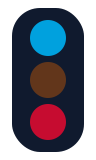
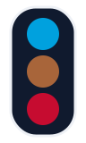
A rounded ink traffic signal, upright, with CTA Blue, Brown and Red lamps from top to bottom. It is an identity, not a traffic signal: the lamps don't mean stop/go and never show live CTA service status. The shapes are flat and geometric to sit with the system's rounded route chips, markers and card radii.
Use Signal for the design system's own surfaces: the docs site, the package icon, release notes and READMEs. Never use it in place of the app's train, bus or station icons, route chips or map markers.
Files
| File | Use |
|---|---|
svg/signal-mark.svg |
Icon-only master, for light surfaces. Light-theme Brown. |
svg/signal-mark-dark.svg |
Icon-only, for dark surfaces: dark-theme Brown and a 3-unit light keyline so the ink housing separates from the background. |
svg/signal-lockup-{light,dark}.svg |
Mark, wordmark and "ChiTransit design system" subtitle. Self-contained: the lettering is outlined, so no font is needed. Use these in production. |
svg/signal-wordmark-{light,dark}.svg |
Mark and wordmark, no subtitle, outlined. |
svg/signal-lockup-{light,dark}-editable.svg |
Live <text> in Figtree with an Inter fallback, for editing. Renders differently on a machine with neither font. Not for production. |
svg/signal-favicon.svg |
Favicon source (the mark). |
png/signal-mark-{light,dark}-{128,256,512}.png |
Transparent raster exports of the mark (sizes are heights). |
png/signal-lockup-{light,dark}-preview.png |
1280 × 360 previews of the lockups. |
manifest.json |
Machine-readable list of files, the palette they were exported with and the token each colour comes from. |
Every file has a transparent background. Don't add a box behind it.
Geometry
- Mark artboard 96 × 160 design units.
- Housing: x 12, y 8, 72 × 144, corner radius 28.
- Lamps: radius 18, centred on x 48, at y 38 / 80 / 122.
- Lockup artboard 640 × 180; the wordmark starts 132 units from the left edge.
Colour
Colours come from tokens/tokens.json; the assets carry exported copies of
those values. go test ./... fails if an SVG in brand/signal/svg/ uses a colour that isn't a
token value. The token keys are in INTEGRATION.md.
| Part | Light | Dark |
|---|---|---|
| Housing | #101A2E |
#101A2E (with #EEF1F6 keyline) |
| Top lamp (Blue Line) | #00A1DE |
#00A1DE |
| Middle lamp (Brown Line) | #62361B |
#A8653A |
| Bottom lamp (Red Line) | #C60C30 |
#C60C30 |
| Wordmark | #101A2E |
#EEF1F6 |
| Subtitle | #5B6472 |
#98A2B3 |
Typography
- The brand typeface is Figtree 700 (wordmark) and Figtree 500 (subtitle), the system's
font.family. - The production SVGs are outlined Inter Bold / Medium, a close portable stand-in, not Figtree outlines. Replace them with Figtree outlines from a licensed local source before final approval.
- Don't stretch, slant or re-track the wordmark to fit a space; pick another size or the mark alone.
Clear space and size
- Keep at least one lamp radius (18 units, an eighth of the housing height) clear on every side.
- Keep at least 12 px between the mark and separate adjacent text.
- Show the mark at 32 px tall or more so all three lamps read. Below that, or when width is tight, use the mark without the wordmark.
- The mark is tall, not square. For favicons and app-style icons it is centred in a square; a purpose-drawn square optical version would read better at 16 px and is still to do.
Do
- Light lockup on light, uncluttered surfaces; dark lockup on dark surfaces. Where a page has a theme switch, follow the page theme, not only the OS setting.
- Keep the lamp order Blue, Brown, Red and the fills flat.
- Keep the signal upright with all three lamps visible.
- Use SVG wherever it is supported; export rasters from it for everything else.
Don't
- Swap the lamps for status colours (green / amber / red) or any other line colours.
- Add gradients, glows, heavy shadows or lit-lamp effects.
- Use the lamps as status indicators or animate them as if they change.
- Put Signal where a train, bus or station icon belongs.
- Add a solid background inside the asset files.
Accessibility
- Next to visible "Signal" text, the mark is decorative:
alt=""/aria-hidden="true"/accessibilityHidden(true). - Standing alone, give it a name: "Signal design system".
- The lamps carry no meaning, so nothing depends on telling their colours apart.
- The light housing on a dark surface is near-invisible (ink
#101A2Eon paper#0F141C); that is why the dark variant has a keyline. Always use the dark variant on dark surfaces.
Changing the artwork
When a lamp, ink or muted token changes, update the fills in brand/signal/svg/, re-export the PNGs
from the SVGs, and run go generate ./... so the docs site's copies follow. The outlined wordmark is
a build product: regenerate it whenever the text or typeface changes. Bump version in
manifest.json with any change to the artwork.